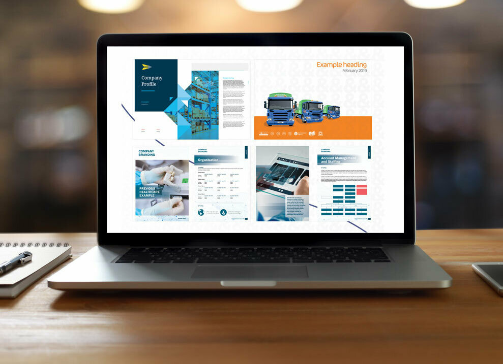
Tenders and Graphics: Elevating Your Bid Response
Responding to tenders involves adhering to a myriad of instructions, from formatting and design to the type of documents you submit. While these guidelines must be strictly followed, there is also significant scope for creativity and strategic presentation through bid graphic design. Incorporating graphics, infographics, tables, and process flows can enhance the clarity and appeal of your bid, even when certain restrictions apply.

Following Instructions: The First Step to Success
While incorporating graphics and design elements is beneficial, it’s crucial to first adhere to the tender instructions. This includes:
- Formatting Requirements: Follow specified fonts, sizes, and margins to ensure your document meets the tender guidelines.
- Design Constraints: Respect any restrictions on design elements, such as the use of colour or logos.
- Document Type: Submit the required types of documents (e.g., PDF, Word) as specified in the tender instructions.

The Role of Graphics in Tenders
Enhancing Clarity and Engagement
Graphics play a crucial role in making your bid documents more engaging and easier to understand. Visual elements can break up large blocks of text and present complex information in a more digestible format. Infographics, for instance, can effectively summarise data and highlight key points, ensuring that evaluators grasp the most important aspects of your proposal quickly.
Highlighting Key Information
Tables and process flows are invaluable for displaying structured information clearly. They allow you to present timelines, deliverables, roles, and responsibilities in a straightforward manner. This not only makes your bid more reader-friendly but also demonstrates your ability to organise and manage projects efficiently.
Reinforcing Your Brand
Including your brand elements within the graphics and overall design of your bid documents helps convey a professional and cohesive image. Consistent use of your company’s colour scheme, logo, and fonts can reinforce your brand identity. This consistency builds trust and reassurance with the buyer, showcasing your attention to detail and professionalism.
Need bid design support?
Contact usStrategic Use of Graphics in Restricted Formats
Even when you are restricted by tender portals that limit design elements, you can still convey your brand and professionalism through strategic use of graphics within your supporting documents. Here’s how:
Case Studies
Incorporate graphics in your case studies to illustrate project successes. Use before-and-after images, project timelines, and impact charts to tell a compelling story of your previous work. This not only makes your case studies more engaging but also visually demonstrates your capabilities and successes.
Policies
Design your policy documents with your brand in mind. Even if these documents are text-heavy, using branded headers, footers, and icons can subtly convey your company’s identity and professionalism. This consistent branding across all documents reassures the buyer of your organised and professional approach.
Supporting Documents
Use graphics in supporting documents such as organisational charts, risk management plans, and technical diagrams. These elements can clarify your proposed methodologies and organisational structure, making it easier for the evaluators to understand and appreciate your proposal.


